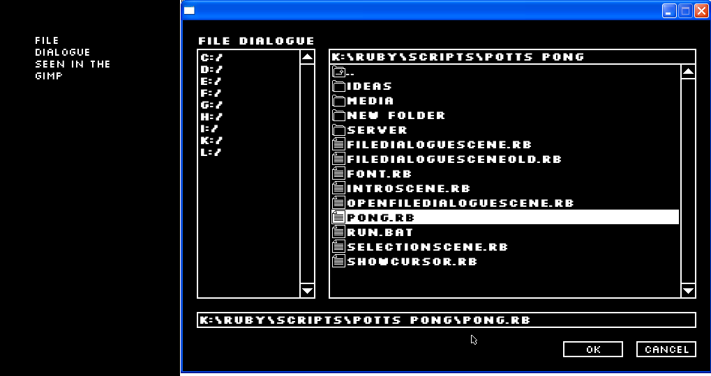
I am using the font "Silkscreen" for my game and it doesn't appear to draw correctly compared to a sample in gimp, take this image for instance:

The image on the left shows the font at size 16 normally, the image on the right shows Gosu's drawing of it at size 16 showing a much thicker, bulkier font, I would much rather see the crisp text I was expecting to see, like the one on the left of the image. Can anyone help? Thanks in advance, ell.
